
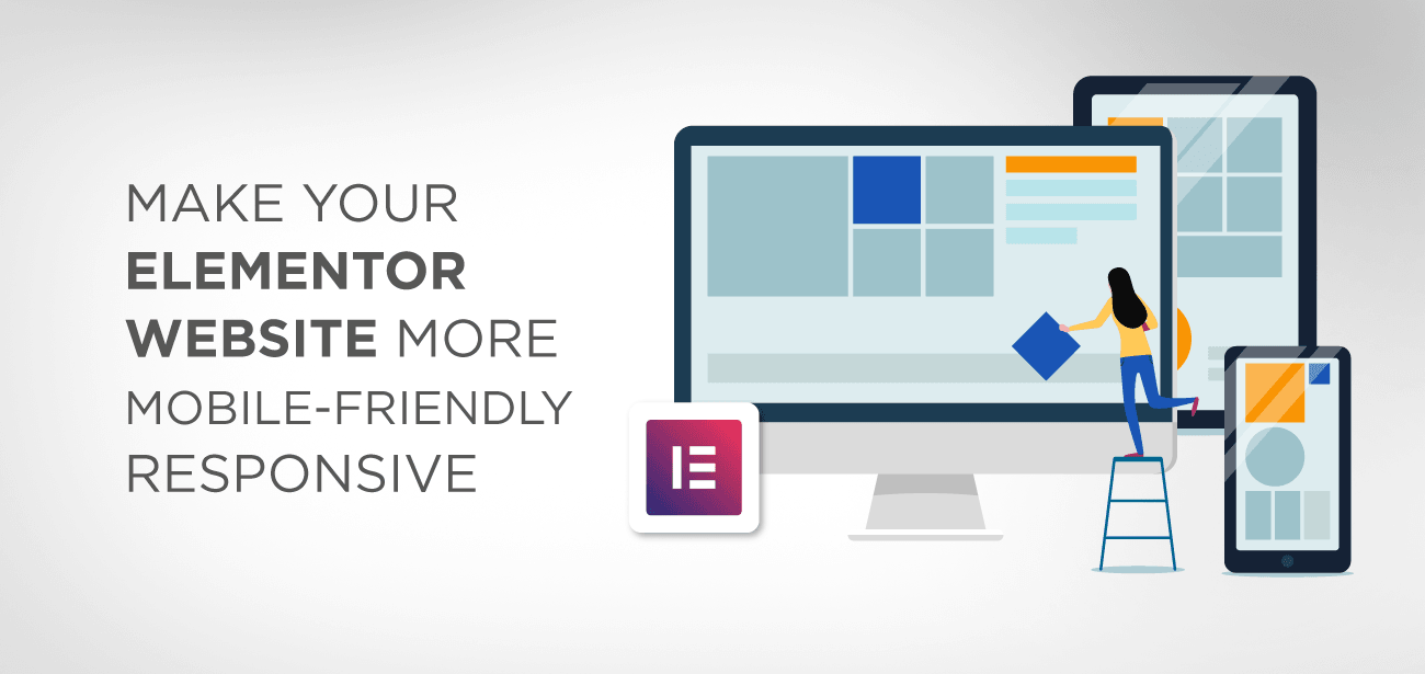
A mobile responsive website is an vital part of any online business.
Google has been using mobile page load speed as a key determinant of any website’s search ranking. It’s mainly because more than half of global web traffic comes from mobile traffic.
Therefore, a mobile responsive website is inevitable both for your site health and better ranking in Google search engine. In this article, we’ll focus on how we can create a mobile responsive website with the Elementor page builder.
- What is Elementor’s responsive website design
- How to adjust Mobile, Desktop and Tab settings
- Adjust Headline in your mobile display
- Adjust padding or Margins for Mobile
- Create each column horizontally, and it will adjust wonderfully across all devices
- Change background image as per mobile/ desktop view
- Change visibility of any section on desktop/ mobile view
- Change the column order
- Create an alternative section
- Adjust column width
- Conclusion
What is Elementor’s responsive website design
A responsive layout works innovative by automatically scaling all the content as per each screen size. It automatically resizes images and content on the mobile screen so that your viewers could view your content without any effort.
Most of us buy a theme that claims to be mobile responsive as well; however, things can be frustrating when your theme’s design completely breaks down on the mobile screen.
To overcome such situations, we have come up with a mobile responsive solution where you can build your website design from scratch using Elementor page builder’s responsive layout tools. With the help of these mobile responsive tools, you can tweak any corner of your website layout especially, typography, padding, and Margin and mobile alignment. Also, you will be able to change the column settings and order on Mobile.
Now, you can edit your page’s mobile setting by switching to the mobile view mode and check the following options to adjust according to the mobile layout.
- Check if any Headline looks too large on a mobile screen.
- Check the padding of the content or space on the sides of content
- Check the page column alignment, how does it look perfect; centered, right or left
- Check the column order, if they appear in the right order or you need to change it.
Now, let’s dig out deeper and find out how things are going to work out with Elementor Page builder.
How to adjust Mobile, Desktop and Tab settings
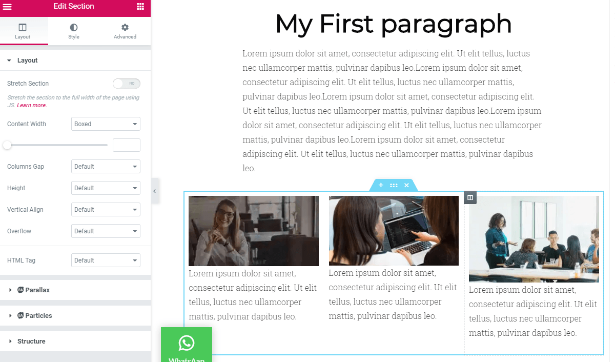
Almost all editable features have the option to adjust Mobile, Desktop and Tab settings. if you click on the responsive mode at the bottom of the menu

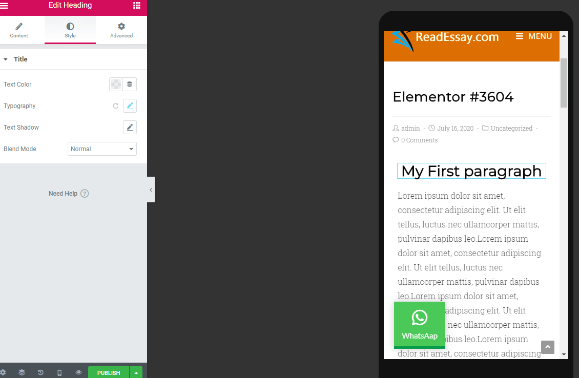
Adjust Headline in your mobile display
Sometimes we want a bold and prominent heading on our desktop site, and it looks perfectly fine on the desktop display, but when you switch on the Mobile view, the heading takes the whole screen and doesn’t look like fit into.
You can adjust the text size of any text element on tab and Mobile. You can also set different text sizes for mobile headings that look great on mobile screen and fit into the screen in a better way. In this demo page, I have created a Heading that looks great on the desktop site, while on the mobile screen it takes the entire screen.
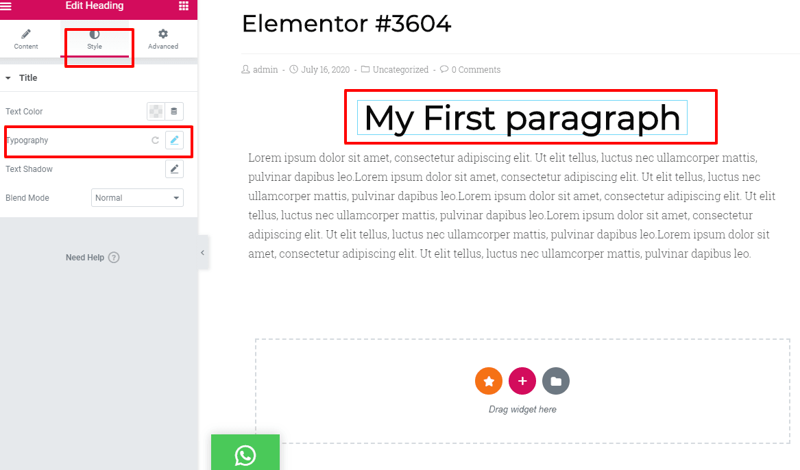
If I click on the edit option of the heading column, I can go into typography section where I can adjust the heading size which looks fine on desktop and also on the mobile screen. I can control both separately. For my desktop site view, heading size is 49px, but on Mobile view, it does not fit in
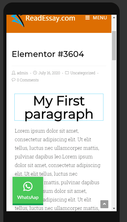
To readjust, I’ll click on the mobile responsive mode > style > typography > adjust px size to 30 which easily fits into the mobile screen.
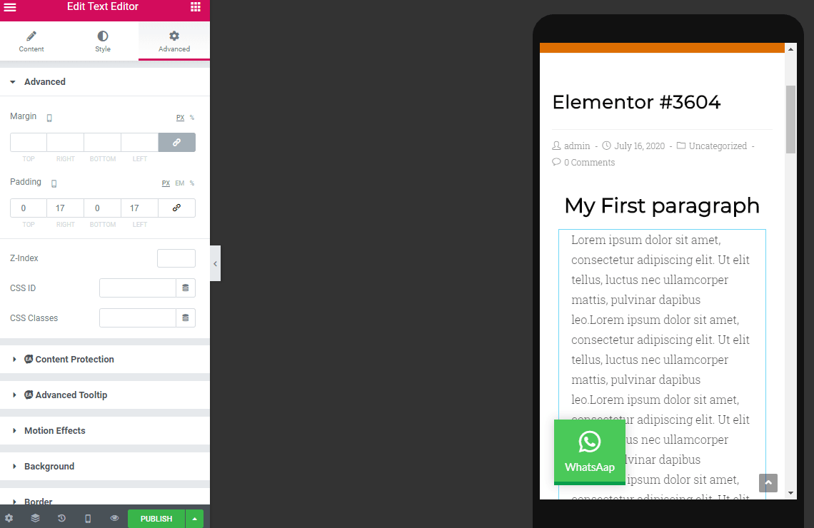
Adjust padding or Margins for Mobile
When adjusting paddings, it is recommended not to use values in Pixels instead of set values in EM or percentage because it will keep the size relative to the overall screen size.
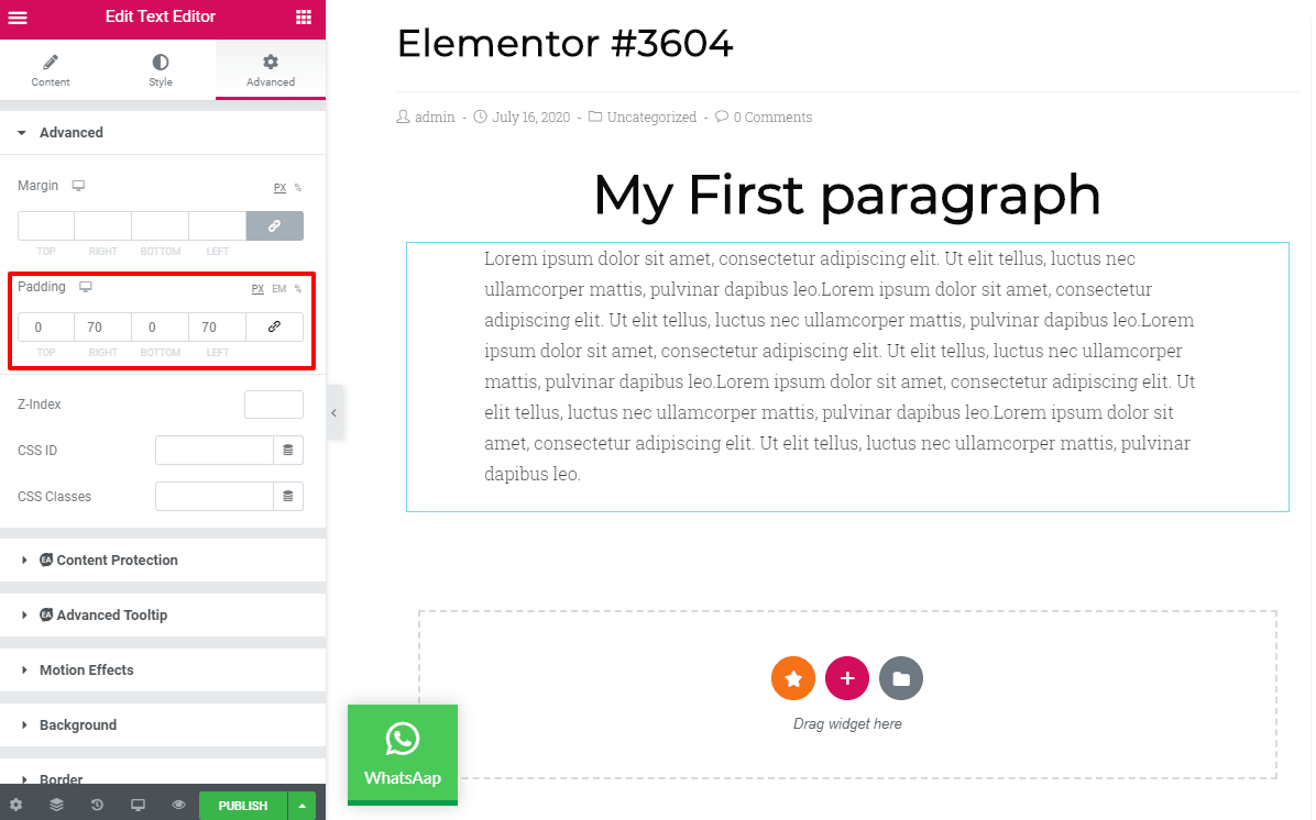
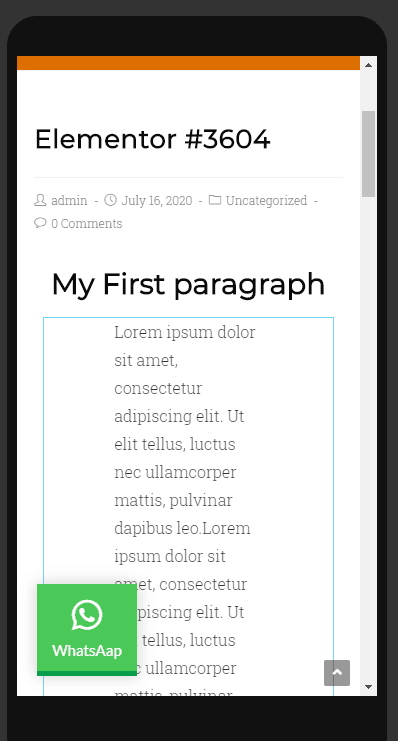
You can see that we have used padding as 70px right and left, which looks well on the desktop site; however mobile view for this setting is a complete mess.
We can readjust the padding to 17 px on each side then it turns out to be completely fine.
Alternatively, you can set the whole columns setting to 750 px where your content will be displayed in a box without any need to adjust the screen on both desktop or mobile view; it will automatically adjust the content within the box.
Create each column horizontally, and it will adjust wonderfully across all devices
Once you create column horizontally, which the designers prefer the most, then you can duplicate the sections and save time. Create one section at a time and then reuse it if it goes well to save time.
Change background image as per mobile/ desktop view
Some background images look good on the desktop view, but the possibility is that the image won’t look as greater as on mobile screen. So, think creatively and choose a different image on the mobile screen. For selecting a different mobile view click on the section > style tab > click on the device icon and select the mobile view. Now, whichever image you choose, it will appear only on the mobile view.
Change visibility of any section on desktop/ mobile view
You can also control the visibility of any section or column according to the device.
Sometimes, we display our content or images in two or three sections or different columns, but we don’t like to display it on Mobile. That’s why Elementor can hide the section which you don’t like to display on mobile view.
Go to > section settings > advanced >responsive There you will see different possibilities or visual preferences; you can hide the section on desktop, hide on the tab or hide on Mobile depending upon your preference.
Change the column order
You can also change the column order from the settings section. Go to; section settings> Advanced >Responsive > Reverse column and click on yes.
Create an alternative section
Create alternative sections on Mobile and desktop view. Sometimes, the slider section doesn’t look as useful on Mobile as on the desktop so you can use any other section instead of using the slider section. You can do this by Go to Advanced tab > turn on / off the visibility of the section you don’t want to display and add an alternate image on it.
Adjust column width
All of the column sections get 100% width when you view them on the mobile view. However, the width can be altered as per column width on Mobile. If you have two columns, you can set the max-width of each section to be 50%.
Conclusion
Elementor comes with all the powerful features to control the responsive column layout of all the screen sizes. It allows you to readjust each section as per view mode selection. Keeping a mobile-friendly website is inevitable because Google algorithm considers ranking mobile-friendly websites the most. Responsive websites are not only essential for getting better SEO, but you also need to get more traffic, because more than 80% of traffic comes from mobile views.
Now Elementor page builder comes with exclusive features that allow its users to create a mobile-friendly site without much effort. Hopefully, you find my article useful and got all of your answers on how to create a responsive website using Elementor.


Świetny post! Bardzo odpowiada na moje potrzeby. Stworzyłam stronę ale widok mobilny mi się rozjechał. Dziękuję za wskazówki. Są bardzo pomocne 🙂
Super! Nie mogłam samodzielnie znaleźć 2 rzeczy o których piszecie – zmiana kolejności kolumn i wyłączenie widoczności sekcji. Wielkie dzięki za pomoc 🙂
Hi, to change column order you can use drag’n drop directly or the section explorer. About the visibility it’s the advanced setup of the section, you’ll need to switch off the desktop, tablet and mobile visibility.
how to do responsive padding?
Hi, the padding is not exactly responsive, this is a fixed value. If you have a responsive problem you need to define different padding value for desktop, tablet and phone