
When constructing a site using Divi, the option to vertically align content might be a valuable addition to your design toolkit. Depending on the layout, content may need to be vertically aligned in various ways (centered, bottom, top). The most common need is for your material to be vertically aligned. It adds a lovely touch of symmetrical spacing to your content, which is very useful when using multiple column layouts. Furthermore, vertically centered content remains centered across browser widths, eliminating the need for custom padding or margins to achieve similar responsiveness.
In this lesson, I’ll teach you how to vertically align content in any column using a few simple lines of CSS. For demonstration purposes, I’ll use several of Divi’s prefabricated layouts. You don’t need to be concerned if you are unfamiliar with CSS. In a matter of seconds, you’ll be able to apply this to your design.
- Understanding the Difference Between Flex and Divi
- Is this required?
- Add the Pre-Configured Layout to Your Page.
- Method 1: Vertically Aligning Content with Flex and Auto Margin
- Aligning the Content at the Bottom
- Vertical Content Alignment for Your Row’s Columns
- Method 2: Aligning Content Vertically Using Column Flex Direction
- What About Layouts With Only One Column?
- Final Thoughts on DIVI’s Vertical and Horizontal Alignment
Understanding the Difference Between Flex and Divi
The Flex (or Flexbox) CSS attribute is just a means to arrange items in horizontal and vertical stacks (kind of like a table). Unlike typical tables, however, the flex feature allows you to build boxes that “flex” to the size of the content they contain.
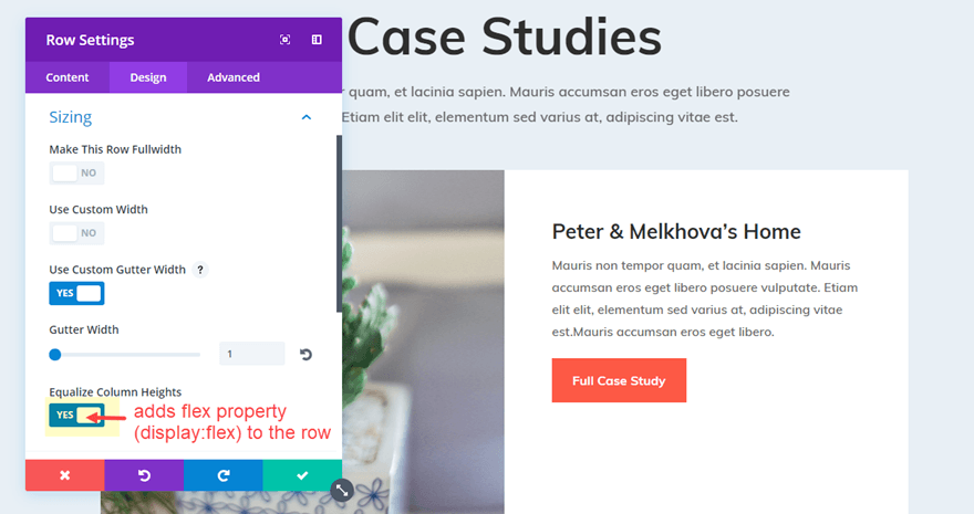
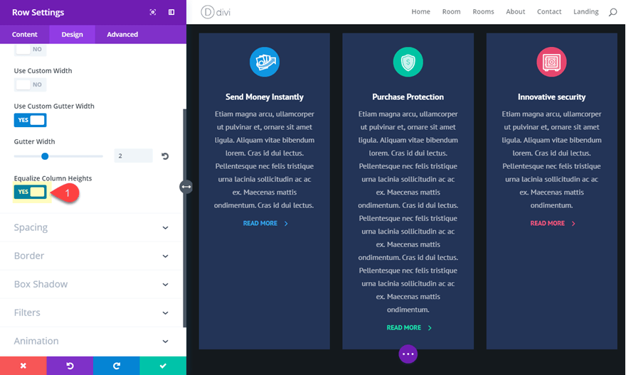
Divi uses the flex attribute when you choose “Equalize Column Heights” as your row setting. Simply put, this ensures that the size of all of your columns adjusts to the size of the column with the most information. Because “Equalize Column Heights” triggers the flex for the row container, you may make use of it by adding CSS to your columns to alter the contents of each column (or box).
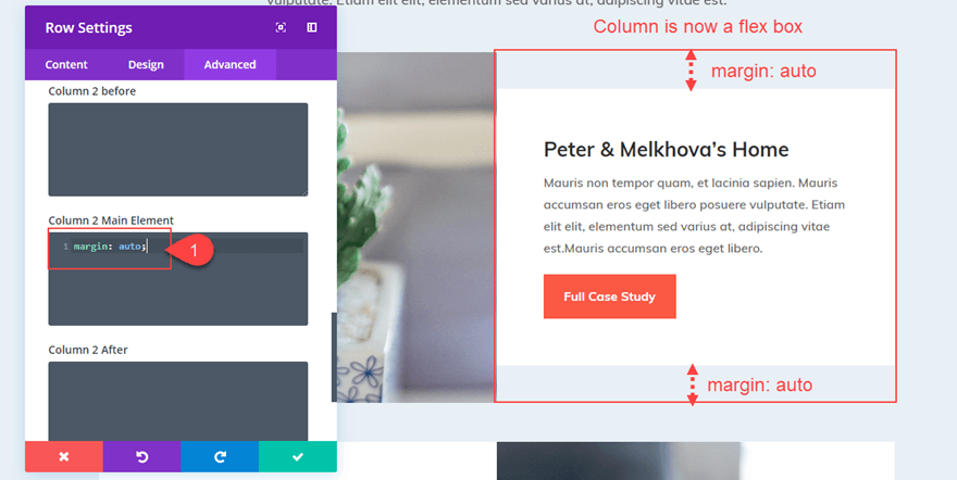
If you add “margin: auto” to any column in a row, for example, the content of that column (whether it’s one or several modules) will be vertically centered.
All of your columns (and their content) will be vertically centered if you add “align-items: center;” to your row.
Of course, the flex property has many more applications in web design and more advanced CSS that you may utilize in your theme. However, I wanted to keep things simple for this tutorial.
Is this required?
In a technical sense, no. You can use custom spacing to position your content/modules vertically within a column (padding and margin). For example, you can use Divi’s spacing options to center the module (s) vertically within the queue to give a column equal top and bottom padding. You can also make the content bottom-aligned by adding top padding to a column. When adding more content to your page, you may need to modify the spacing. Furthermore, maintaining this alignment across multiple browser sizes may be problematic.
So, if you’re searching for a way to align information vertically without having to worry about specific spacing, I think you’ll find this beneficial.
Let’s get this party started!
Add the Pre-Configured Layout to Your Page.
I’m going to start with the Interior Design Company Portfolio Page Layout. Create a new page to have this layout on your page. After that, give your page a name. Select “Use Divi Builder” and then “Use Visual Builder” from the drop-down menu. Then choose “Choose a Premade Layout” from the drop-down menu. Then, select the Interior Design Company Layout Pack from the Load From Library window. Finally, from selecting layouts, choose the Portfolio page and click “Use this Layout.”
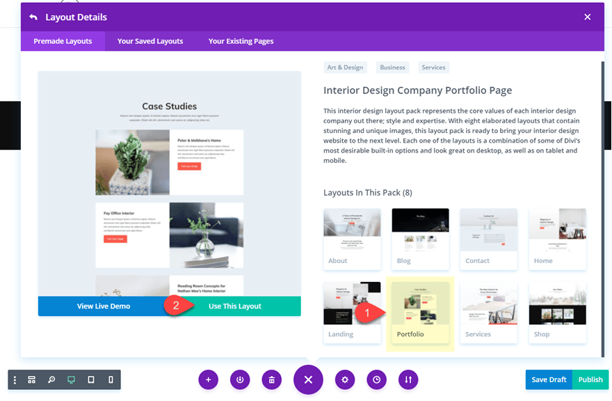
You’re ready to start after the layout has loaded on your page.
Method 1: Vertically Aligning Content with Flex and Auto Margin
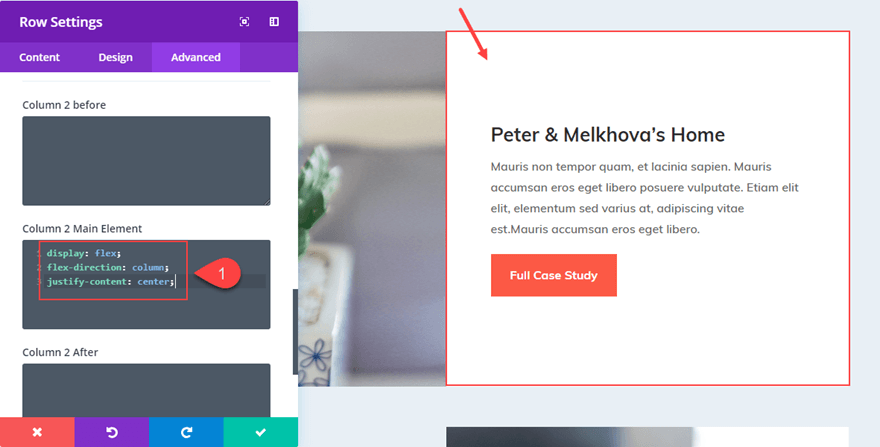
Open the row settings for the second row (the one directly under the row with the page title). Toggle open the Sizing option group in the design options and note that “Equalize Column Heights” is already active; This signifies that the flex property (“display: flex;”) has been added to the row.
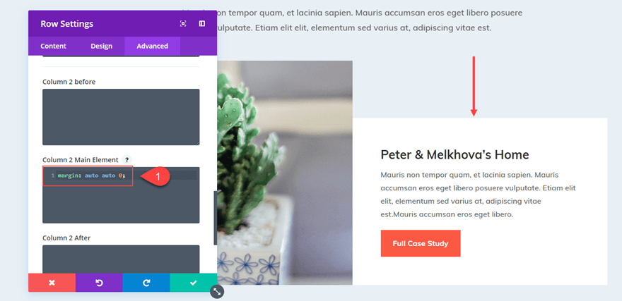
Under the Column 2 Main Element input box, go to the Advanced tab settings for the same row and add the following CSS snippet.
The content of the second column has now been relocated to be vertically centred.
| 01 | margin: auto; |
Aligning the Content at the Bottom
You can alter the margin value as follows to make your content bottom aligned so that all modules stack at the bottom of your column:
| 01 | margin: auto 0; |
Vertical Content Alignment for Your Row’s Columns
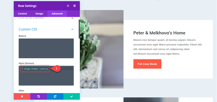
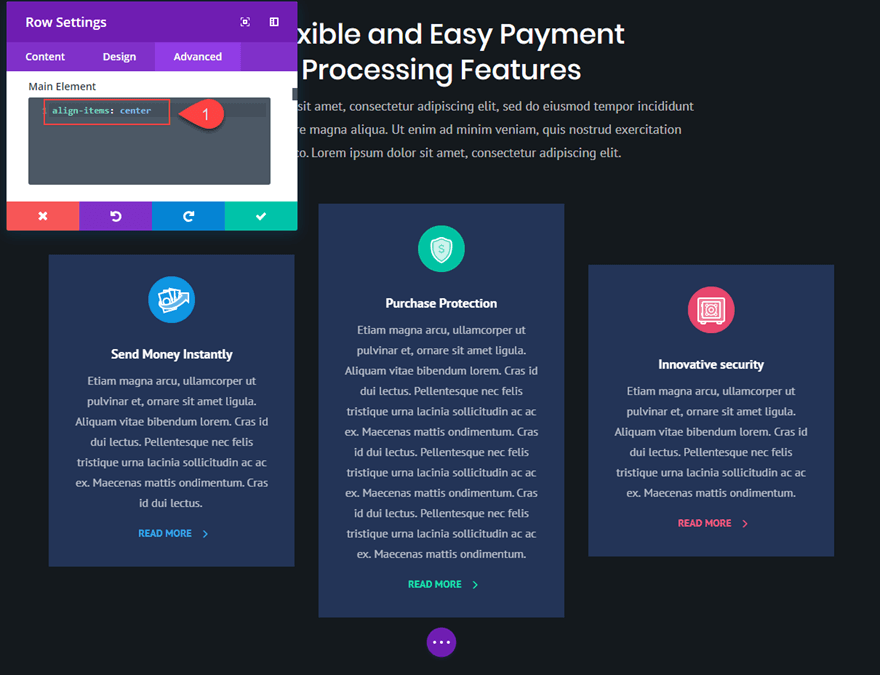
You can vertically centre the content of all columns in your row by adding the following snippet to the main element of your row settings, rather than adding “margin: auto” to each column individually.
| 01 | align-items: center; |
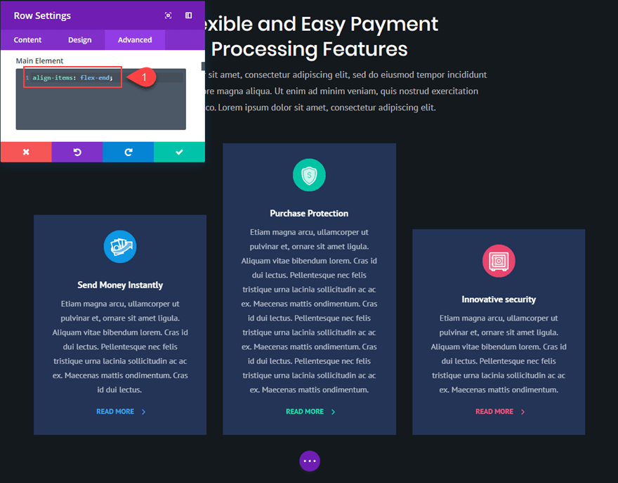
You may also use this snippet if you want all of the information in your columns to be aligned at the bottom:
| 01 | align-items: flex-end; |
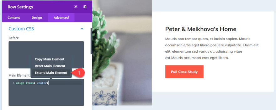
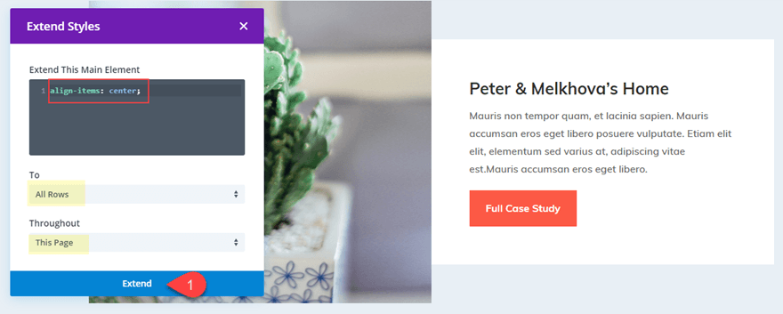
Remember that you may use Divi’s Extend Styles feature by right-clicking on the main element with your CSS snippet and selecting “Extend Main Element.”
Then, to vertically center all of the content of every column on the page, apply the main element CSS to all rows throughout the page (or section).
Everything is now vertically balanced.
However, you may have observed that the white column background colour no longer covers the entire row due to the column’s addition of “margin: auto.” You might remedy this by changing the row background colour to white and removing the row padding. Instead, I’ll teach you how to center the content of your column without having to change the margin.
Method 2: Aligning Content Vertically Using Column Flex Direction
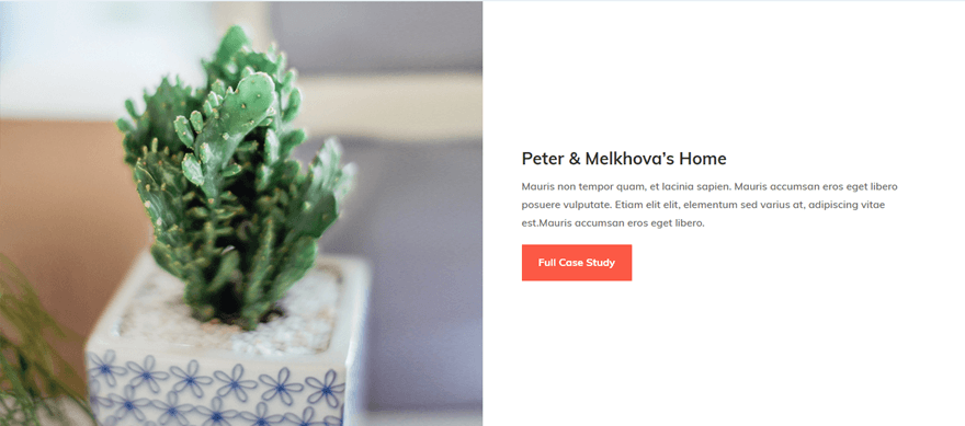
We used the flex property firstly added to the row. As a result, each of our columns became a “flex box” that could be vertically aligned by altering the margin.
However, we can utilize flex-direction to align the text of our column without sacrificing the “Equalize Column Height” effect, which keeps our columns (and column backgrounds) the same size. To accomplish this, we’ll add a few lines of CSS to our queue, causing all of the modules within it to be stacked vertically and then centred.
Let’s return to the previous example’s row. By right-clicking on Custom CSS and selecting “Reset Custom CSS Styles,” you may remove any custom CSS you may have in the Row Settings.
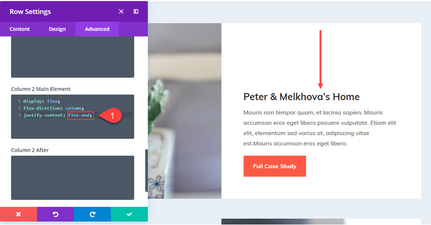
Then, in Column 2 Main Element, apply the following CSS:
| 010203 | display: flex;flex-direction: column;justify-content: center; |
Change “justify-content: center” to “justify-content: flex-end” to bottom align the content.
I like this configuration because if I position my content vertically and make the row full width, the content remains centred.
Making Vertically Aligned Blurbs with Various Amounts of Text
Making the content of your columns vertically centred can also help with blurbs. As you may be aware, not every blurb will have the same amount of text to describe a feature or service. Making these blurbs vertically centred can help your layout look beautiful.
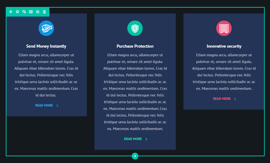
For the Digital Payments Home Page Layout, I will vertically align the blurbs for this example.
To create a more realistic portrayal of a site’s appearance, I’ll first add varying amounts of body content to the blurbs.
Now I need to “Equalize Column Heights” in the row settings.
Now I can align my text and adjust the design using CSS snippets.
We can vertically center the content of our columns by adding the following to the Main Element section of the Advanced tab of our Row Settings:
| 01 | align-items: center; |
Please change it to the following to align them at the bottom.
| 01 | align-items: flex-end; |
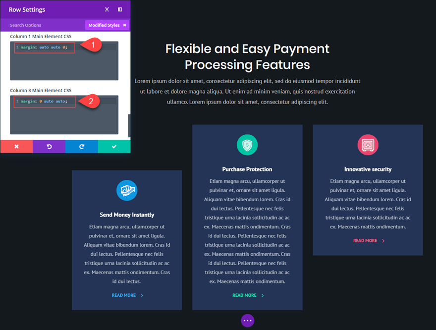
You can also make the first column bottom-aligned and the third column top-aligned by resetting your custom CSS styles and adding the following custom margins.
Column 1 Main Element CSS:
| 01 | margin: auto auto 0; |
Column 3 Main Element CSS:
| 01 | margin: 0 auto auto; |
What About Layouts With Only One Column?
You don’t need a CSS snippet or flex to get your one-column content vertically centred. All you have to do is make sure your text has equal spacing above and below (or modules). Most consumers require vertically centred content on layouts with many columns because they want the adjacent material to line up correctly.
Final Thoughts on DIVI’s Vertical and Horizontal Alignment
Even though this solution relies on a few minor snippets of custom CSS, I feel it can be helpful for people looking for a quick cure to a time-consuming procedure. Please feel free to share your opinions on this approach, as well as examples of how it has saved you time and effort in the past.


Bedankt voor de duidelijke uitleg. Bij een Blog module werkt dit echter niet. Dan is er in de row maar 1 kolom. Het aantal blogs naast elkaar is bepaald door de module (default 3). Zijn hier de kolommen ook gelijk te maken?
Hi, No I’m sorry it’s just meant for classical DIVI columns, DIVI blog module have an entirely different code to align columns.
What if you want the module to be aligned 2/3’ss the way down or 1/3 from top – and not perfectly in the middle top or bottom?
Hi, I’m afraid that it’ll require to do some custom CSS, by default there’s no such option.
Maybe you can try to align content in the middle and add some padding to your content, but please check carefully the rendering on all devices.