
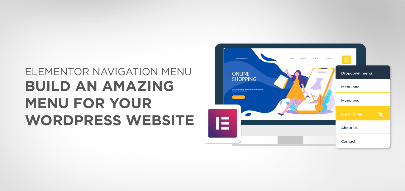
Are you looking for a way to create an amazing menu to help improve your website’s UI/UX? If so, then you are at the right place. Here we have put together a detailed guide to help you out.
Af first, we show you a step-by-step walkthrough on how to create a menu for your WordPress website. And once you get a hang of that, we will guide you on how to use the Elementor Navigation Menu widget to customize and supercharge your WordPress menu.
Table of Content:
- Why Do You Need A Custom Navigation Menu?
- Create a Basic WordPress Menu using Elementor
- 1. Create a simple menu for your WordPress website
- 2. Choose and customize navigation menu items
- 3. Create Submenus – Parent and Child Menu Items (Optional)
- 4. Manage your menu location and publish
- How to create a navigation menu using Elementor pro nav’ widget
- Elementor Nav-Menu widget Key Features
- Create a menu with nav-menu pro widget
- Mobile responsive menu
- Wrapping up
Why Do You Need A Custom Navigation Menu?
It’s critical to know that the navigation menus are important not only for bringing traffic to your site but also for better SEO ranking.
Indeed, the nav-menus are primarily designed for user engagement, but this is not the sole purpose.
The second most important factor is to keep in view the role of “WebCrawler” or Bots that are designed to crawl the websites and index the content to the relevant level and reporting back to the search engine to rank the content in the right place.
Therefore, if you are creating too complicated menus, then it would be difficult for the bots to rank your content, but also you’ll lose your visitors.
In short, “ease of navigation” is a pivotal contributor to enhancing better user experience as well as plays an imperative role in boosting our site ranking and boosting traffic.
It’s an excellent reason for many business websites to keep a single navigation icon instead of a complex menu bar, which loads up to a full-screen menu when clicked.
Thanks to the Elementor pro widget with a 100% responsive navigation menu, you can create a pixel-perfect and incredibly flexible menu bar without using any code.
In this tutorial, we’ll demonstrate to you how to use the Elementor navigation menu widget to get the customized, advanced WordPress menu.
Before starting with the Elementor Navigation widget, let’s explore how we can create a simple WordPress menu using Elementor free version.
Create a Basic WordPress Menu using Elementor
Now, to create a WordPress menu, you don’t need to install any special plugins. By default, WordPress comes with an easy-to-use Menu builder, that will help you to create simple navigation menus for your website.
That being said, you will not have access to any customization options for the menu. It will take on the design of the currently active WordPress theme. But if that is all you want, then this is an excellent way to set up a navigation menu for your WordPress website.
1. Create a simple menu for your WordPress website
First things first, you will need to log in to your WordPress backend dashboard.
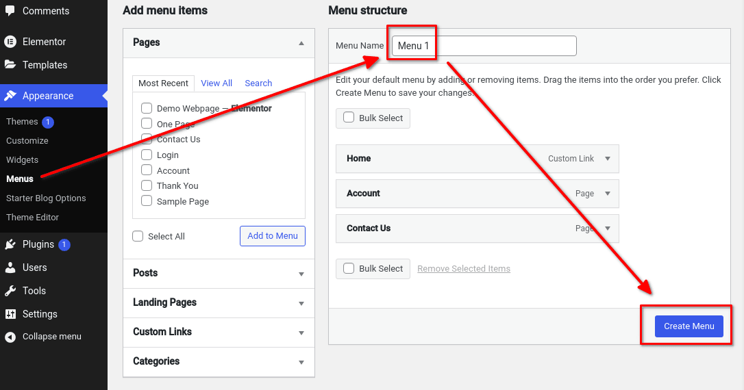
Now, from the lefthand sidebar go to Appearance > Menus. Here you will find a two-column layout with “Add menu items” to the left and “Menu Structure” to the right.
Under Menu Structure, you will find a field for the “Menu Name.” This will be the name for the menu we will be creating right now. Let’s call it Menu 1.
Note: Don’t worry. Your readers won’t be able to see the Menu names. It is a feature to help you keep all your different menus organized.
After giving your Menu a name, click on the “Create Menu” button to make it available. Now, you need to add the different menu items.
2. Choose and customize navigation menu items
Now comes the part where you populate your new menu with menu items. Under the “Add menu items” section to your left side, you will find an organized list of things that you can add to your menu.
By default, this contains any of your pages, posts, landing pages, custom links, and categories.
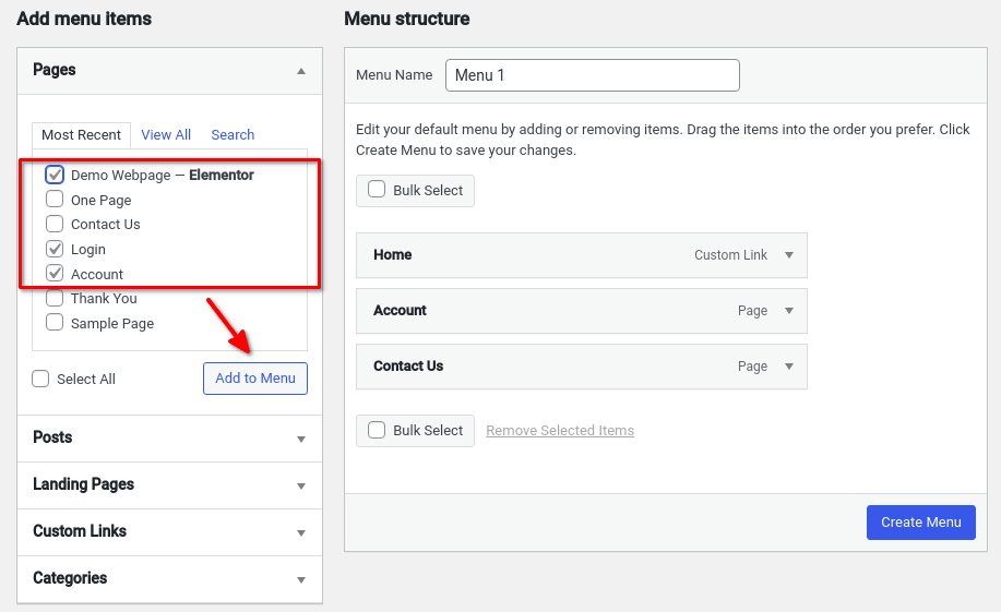
just select the menu items you want to add using the checkbox, and then click on the “Add to Menu” button. This will populate your menu with all your selected menu items.
Note: Notice each section under the “Add menu items” has the option to switch between – Most Recent, View All, and Search. Remember to use these options if lots of items.
Once you are done adding all the menu items, hit the “Save Menu” button, and on to the next step.
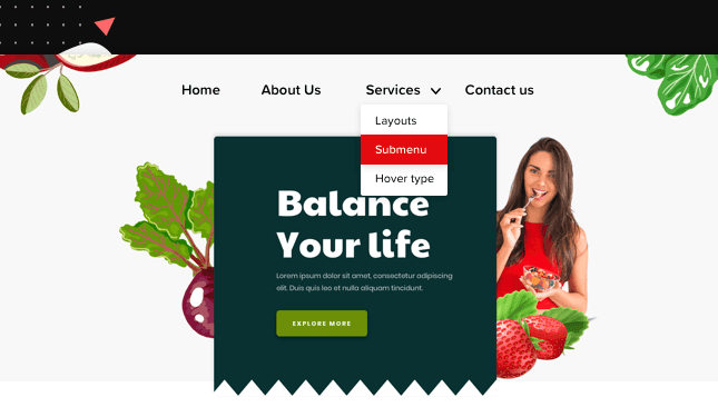
3. Create Submenus – Parent and Child Menu Items (Optional)
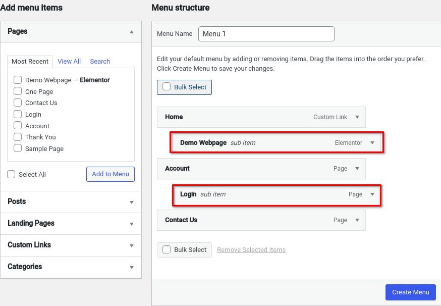
Did you know that by default WordPress allows you to create submenus as well? When creating the submenu structure, you have a parent menu item and a child menu item.
When a user hovers over the parent menu item, it will reveal all the child menu items hidden under it.
Cool right?
Now to create a submenu structure, all you have to do is pick a menu item that you want to be on the parent menu. Next, drag and drop all the menu items that you want as child menu items under it. Now just drag it to the right and you are done!
4. Manage your menu location and publish
Now that you have created your new menu and added submenus, it’s time to manage its location.
At the top of your menu editor, you should notice an option called “Manage Locations.” Click on it and something similar to the following screen should show up:
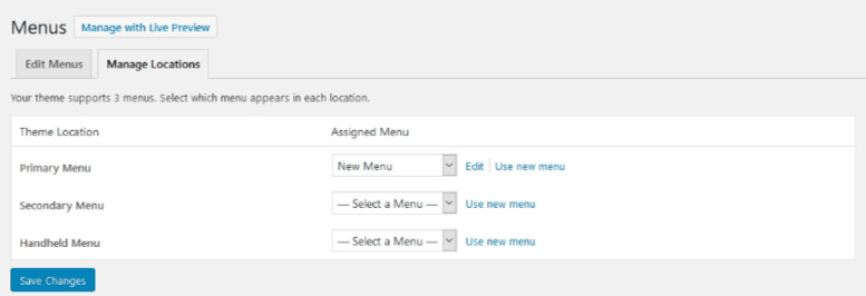
Now, the available menu locations will depend on the theme you have installed. In this example, we have a theme that supports 3 menus.
After assigning a menu to each of the available menu locations click on “Save Changes” and that’s it.
You now know all the basic menu features WordPress offers by default. However, if you want more customization and functionality, read on to learn about the Elementor Pro Nav Menu Widget.
How to create a navigation menu using Elementor pro nav’ widget
If you like to add a customized nav’ menu to your WordPress site, you’ll need the Elementor Pro version. The Elementor Pro version comes with Elementor nav widget along with many other special features such as 300+ templates, a theme builder, a popup widget, WooCommerce widgets, and many other interesting features.
What are the specific key features of the Nav Menu widget itself? Here is a brief introduction.
Elementor Nav-Menu widget Key Features
- The Nav-menu widget gives you the freedom to place your menu anywhere you like to. On your header or the top or anywhere on your page.
- You can add multiple menus on your site and also on your pages separately or globally.
- Give a dazzling look to your menu by using animation, hovering effects or active status
- Create a mobile responsive menu of your site and control how your site will look on mobile screens
- Customize color, typography, and padding or other adjustments of your menu bar
- Create a pixel-perfect menu with the right precision of alignment, spacing, and padding.
Create a menu with nav-menu pro widget
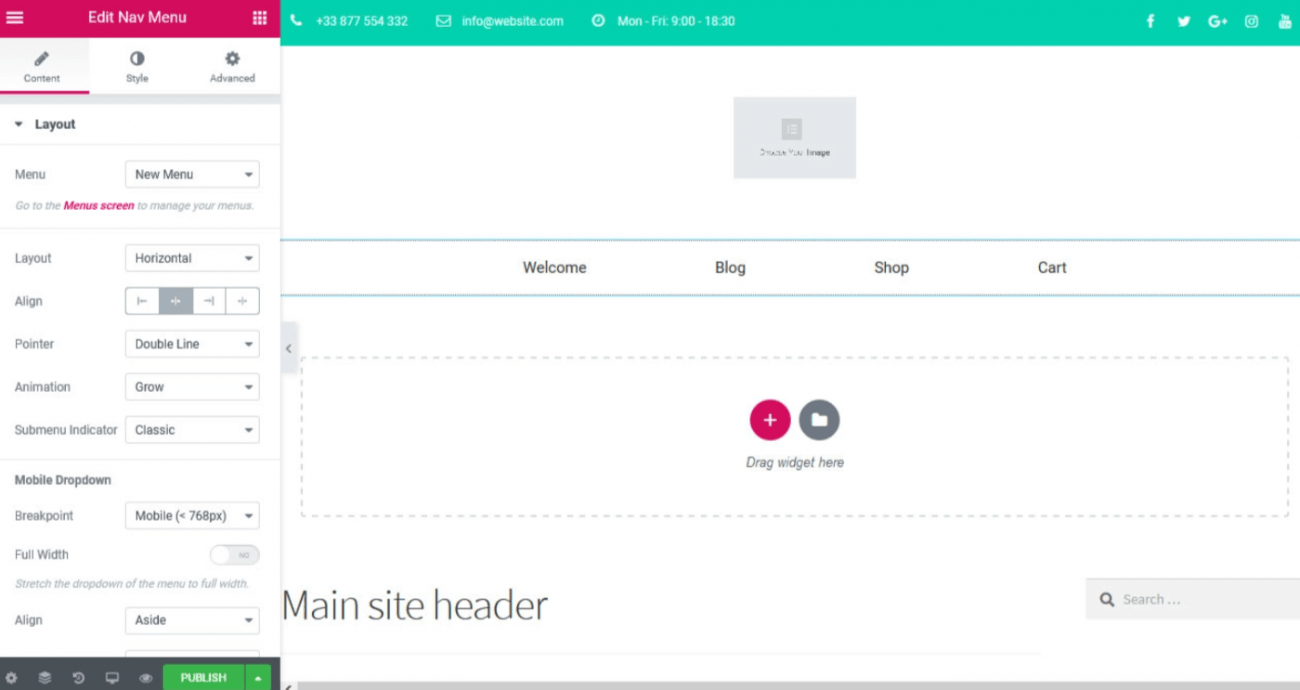
You’ll need to create a basic WordPress menu as we have mentioned above and then you will customize the default WordPress menu using the pro-nav-menu widget. Once you have created the primary list, then the next step is to add it to your desired location, i.e. Header section.
Now when you are done with basic settings, let’s customize the menu using the nav-menu widget.
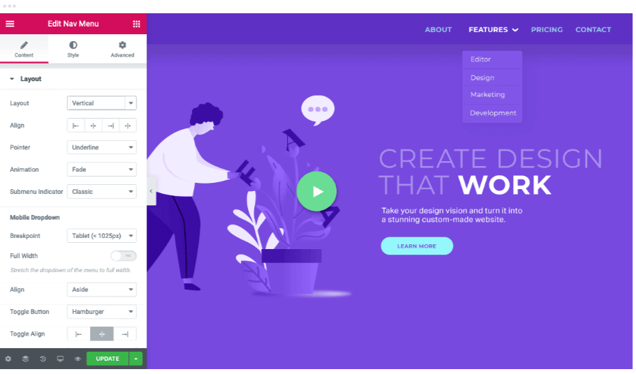
On the topmost corner of the setting section, there are three options available; Content, Style, and Advanced.
The Layout section: you have three options Horizontal, vertical, or a hidden dropdown accordion.
- Horizontal: The horizontal layout is the most common layout used by the sites. It spreads across the screen from the direction of left to right.
- Vertical: You will also find a vertical layout on many sites, specifically on sites that offer creative services. In the case of a vertical layout, the spread of the navigation bar will be from top to bottom.
- Dropdown: Dropdown menus are also pretty common. Dropdowns are vertical layout and require interaction with the user to reveal. They are mostly used to create a clean design.
Align section: this section helps you to align the menu text items; center, right, or left.
Animation section: this section will allow you to add animation effects under, over, or double line animation effects. You can also go for the frame, background, and subtle text animations.
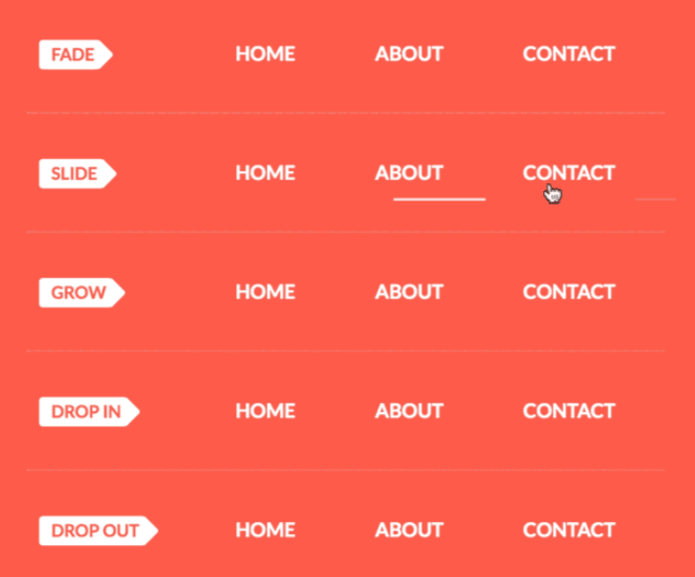
The underline animations are as follows:
- Fade: The fade animation offers fade animation below the menu items.
- Slide: The slide animation slides the bar below the menu items.
- Grow: The grow animation grows from the middle to outwards and gives a sensation of growth.
- Drop in: Drop in animation flows from bottom to top.
- Drop out: Drop out animation flows from top to bottom.
Similarly, there are framed, overline, double line, background, and text animation. Each one of them offers their own set of animations and you can check them out yourself to learn what you get with them.
Pointer section: select the type of pointer from the dropdown menu.
Submenu indicator section: the Elementor widget is packed with many submenu styling options. Where you can not only control the color, style, and also the background of the menu.
Padding and menu spacing: padding can be adjusted quickly. You can change the horizontal padding for menu and submenu, vertical padding, in-between space also the right, left, and centered alignment.
Elementor approaches menu spacing and padding extremely well. They worked hard behind the doors to ensure that they can bring the tools to the developer so that they can easily create the design that they are thinking about.
The menu spacing offers a lot of options including:
- Space between menu items
- Horizontal and vertical padding for menu and submenu elements
- Center, left, right, and justified alignment.
Colour background and Typography: you can get your tailored-branded look with the help of the desired color scheme and background color. Also, you can choose the transparent or semi-transparent menu options as well.
As a designer, you can play with these options as much as you can and ensure that you design the backgrounds as per your likings.
Mobile responsive menu
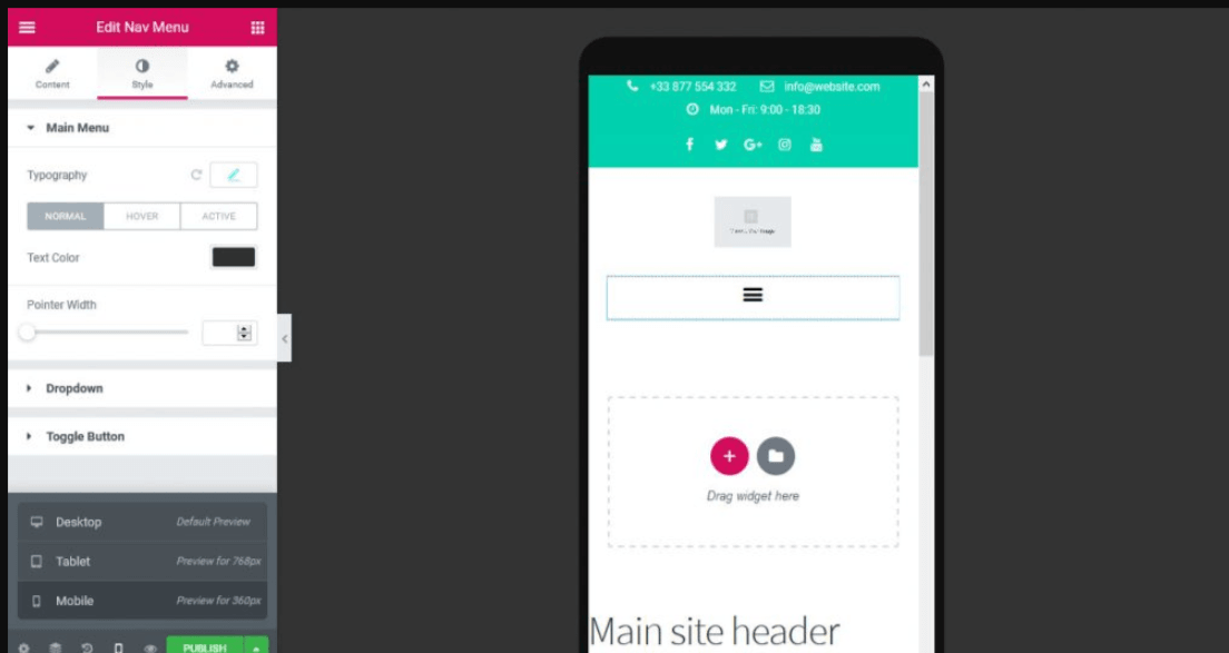
Mobile is an important part of the web, and that’s why Elementor developers also provide tools so that you can create the navbar for the mobile as well.
Elementor widget allows you complete control for mobile menu options on WordPress. You can control the mobile screen view with a separate set of settings for mobile-only screens. There is an option for mobile screen settings at the bottom of the Elementor setting section where you can view your mobile screen options.
In short, the Elementor’s mobile menu features are as below:
- Full width on mobile: You get the option to set full width or limited width as well.
- Tablet or mobile breakpoints: You can use the breakpoint settings to set the mobile menu for mobile or tablet.
- Vertical and Accordion Menus: Elementor also offers the option to display a collapsible hamburger icon.
- Toggle align: The hamburger icon can be aligned center, left, or right.
- Aside/Center alignment: Choose the alignment of the mobile menu.
Responsive navigation: Offers responsive positioning of the menu.
Wrapping up
The menu is one of the most significant features of any website. Because it helps the visitors to walk through your website and if you created a list smartly it’d help in keeping your visitors on your site for a long time. The menu is equally important as that of any website’s entire layout, the header, and the footer section.
Therefore, the menu widget must be capable of delivering your unique brand look with all the essential features. The Elementor Navigation widget comes with feature-rich capabilities that allow the customers to customize the menu section to fit into your brand’s voice. Now, you can use a custom tailor-made stylish menu across your website, on your landing page, header, or any other section where you like to display it.


Hola gracias por el post, cuando añado el nav menú no me aparece mi menú se queda solo un recuadro gris en el editor de elementor y si voy a la pagina donde lo tengo no aparece nada. Como puedo solucionarlo? gracias
Hi! Usually, this problem appears when your menu is either empty or not saved. Please double-check on WordPress menu side.
Hola, una consulta, cómo se puede dar la instrucción para cerrar automáticamente un submenu al abrir otro ítem del menu.
Gracias.
Hi, sorry I don’t understand fully your question? Could you specify?
ciao quando le voci del submenù sono troppo lunghe come si riesce a dividerle su più righe ?
Hi, this is not recommended because the navigation would be very complex to read, in this case it’s better a mega menu style
Menu w wersji mobilnej nie otwiera sie. Jak moge je utworzyc zeby wyswietlalo sie na telefonach?
Hi, the mobile menu display is automatic if you use the Elementor navigation widget. But you should check a setting call “breakpoint” in the menu settings. This is the screen size when your menu will toggle.
Tôi dùng thằng này, mà trên destop tôi để chế độ Horizontal mà nó không nằm ngang, nó cứ nằm dọc, tôi dùng theme Creaton. Có gì hỗ trợ mình với nhé.
Sziasztok, az miképp oldható meg, hogy egy vertikális menüben az almenüre kattintás után ne zárja össze a menüt az oldal betöltésekor? EPro
Hi, unfortunately that’s not possible, there’s no such option in Elementor nav widget.
Ciao. Vorrei sapere se è possibile fare in modo che il menu rimanga sempre visibile anche quando si scende con la visualizzazione della pagina. Purtroppo tutte le volte che ci ho provato il menu scende ma il colore di background del menu no rendendolo praticamente illegibile le scritte. Grazie