
While you work with Elementor, you will notice that it is a bit tricky to custom position your sections and columns. You need to align columns and sections vertically and horizontally, to achieve a responsive “stretch-to-fill” layout. Without this alignment, the elements of columns with varying heights will fail to adjust on-screen.
- Why Do We Need to Align?
- How do Columns or sections work for a Responsive Design?
- How to align Elementor sections and columns?
- To Fix Responsive Width Problems Use Overflow Hidden
- Taking Care Of Positioning
- Relative Units
- Control the Depth of Each Element Using Z-Index
- The Trick About Duplicate Functionality
- Offsets
- The Golden Rule
- Conclusion
Why Do We Need to Align?
In each column or section, the content can be of different categories. It can be in the form of pictures, text, and ratings. For a put-together look, it is recommended that there is uniformity in content appearance. It should not be just thrown there- dumped- just for the heck of it.
With good alignment, you can make the website appear more neat and classy- so that it does not look cluttered. With the alignment option, you can adjust several widgets of varying sizes next to each other in the same column.
How do Columns or sections work for a Responsive Design?
Elementor 2.5 enables you to custom position your design and content. With the new custom positioning feature, you can move the widgets to any location. But, you can’t really do it beyond a certain section. These widgets are relative to the column they’re inside. This can cause a problem in the responsiveness of the design.
Suppose you have a three-column layout. With the help of custom positioning, you can drag-and-drop a widget from the right column into the center column, or however you like it.
But doing so will only benefit desktop visitors because it will look OK to them. However, it will cause a problem if the website is accessed from mobile because Elementor stacks the columns vertically on mobile.
So instead of having three columns side-by-side, you might experience all three columns stacked on one another. The element will no longer appear in the middle column as it does on desktops.
Although, you can smartly tweak the mobile view with a hidden setting, but there is no guarantee that the majority of people can find it. So, why frustrate the users? Making the design responsive and adaptable is the right solution. So that it does not crash anywhere.
For that matter, you need to pay attention to the widget’s relation to the column it’s inside.
How to align Elementor sections and columns?
For each section/column, land on the layout section and set the following alignment options as per your requirements:
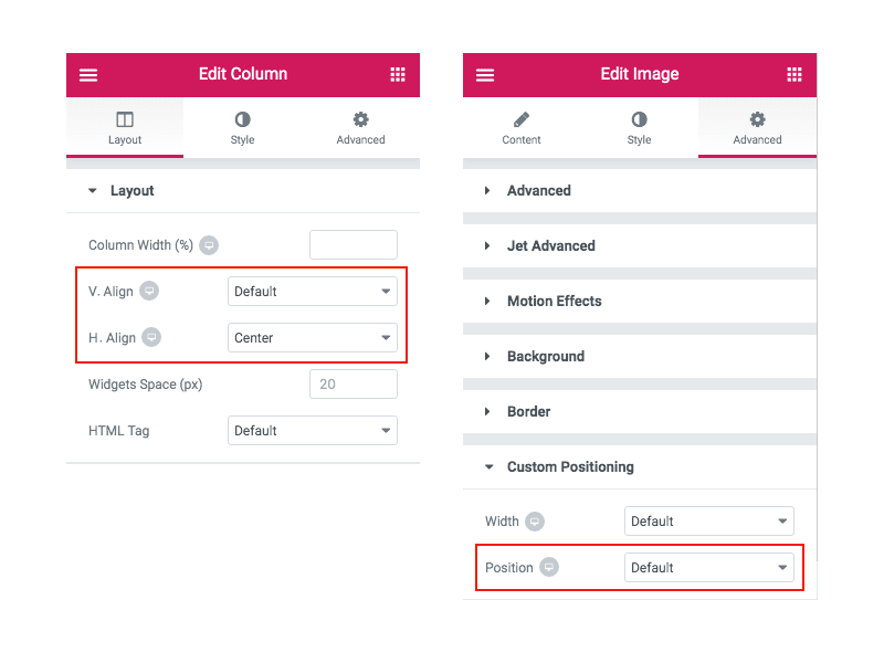
- Vertical Align: you can pick settings for the widgets from following. But one thing you must keep in mind is that the content in a column cannot be aligned with the first three column vertical options i-e top, middle and bottom.
- Top
- Middle
- Bottom
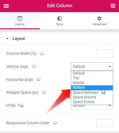
For that matter, there are *three new options which make it really convenient to align the content as per your liking.
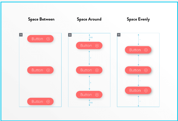
- *Space Between – sets the space between widgets in the start and at the end at the edge of the column. The widgets are equi-spaced i-e there is equal space between them.
- *Space Around – the space between the widgets is equal, and the edges are half the size of the space between the widgets.
- *Space Evenly – the space between widgets is uniform- it is equal between, before and after them.
- Horizontal align: with this option you can perform inline positioning and align the inline widgets, which are in the same row, horizontally. You can align the columns’ content horizontally using these options:
- Start- aligns all the icons to the left
- Center: positions the icons to the middle of the column
- End- sets all the icons to the right
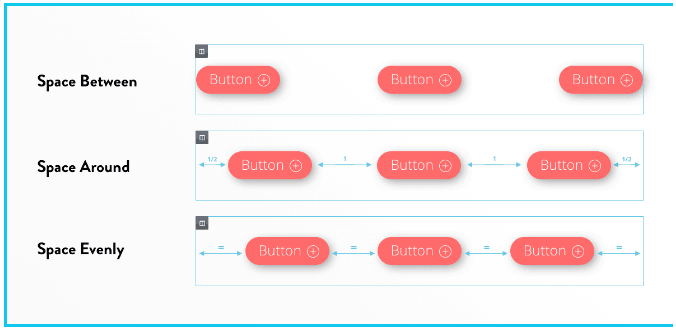
- Space Between – the space between widgets in the start and at the end at the edge of the column. The widgets are equi-spaced i-e there is equal space between them
- Space Around – the space between the widgets is equal, and the edges are half the size of the space between the widgets
- Space Evenly – the space between widgets is uniform- it is equal between, before and after them
To Fix Responsive Width Problems Use Overflow Hidden
When it comes to a website’s appearance on mobile, there is high probability that you might run into an problem where a widget with custom positioning overflows the width of a column.
This causes a really frustrating situation for mobile visitors, where they can horizontally scroll. And this is not something which you had wanted for your website. This can be fixed by:
Layout Settings > Set the Overflow option to Hidden
By doing this, the exceeding area will be cut off, and there will be no need for scrolling horizontally
Taking Care Of Positioning
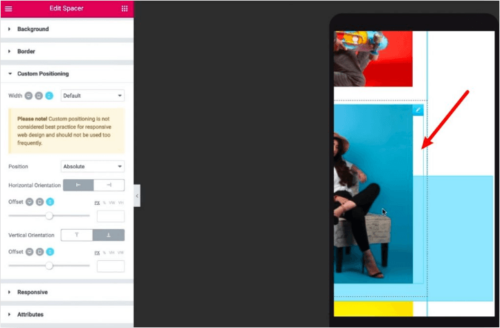
You also need to take care of the positing of the columns. You can set custom positioning with Elementor 2.5 — absolute and fixed.
The absolute positing is the positioning of the element relative to the section or column that you are inside. So, if you use absolute positioning to an element or a section then that section will not move along the visitor’s window.
The fixed position is different from absolute as it lets the section/element stay fixed to the visitor’s viewpoint. So, if the user scrolls through the page, the element will stay there.
Relative Units
As you design your webpage, you will find that there are multiple ways you can position the elements. For absolute positioning, it is a good idea to use relative units as it will make responsive design more functional when it comes to different screen size.
The relative unit adjusts themselves based on the relative width and height of the screen, hence allowing the elements or sections to resize themselves and a better responsive design. If you opt to use pixels, then you need to create multiple responsive sections for different screen sizes.
Control the Depth of Each Element Using Z-Index
If you are going to use ‘absolute’ or ‘fixed’ positioning for the widgets, there will be a lot of situations where two or more widgets might overlap i-e they are stacked “on top” of one another. You can avoid this by using the normal Z-index setting. This will enable you to control the depth and allow you to pick which widgets appear in the foreground.
The Trick About Duplicate Functionality
If you are using right-click to duplicate an element with custom positioning, it might look like that the right-click has not worked.
But, behold. That’s not true. The duplicate functionality has worked perfectly fine and has duplicated the element. It’s just that since each element has the exact same custom positioning, the duplicated element stacked EXACTLY on top of the other element (giving an impression that no duplicate has been created.).
In simple terms, if you create one column successfully, you can duplicate the column whenever needed. Also, make sure that the columns that you create don’t use custom positioning. If it does, then duplication will not work with the right-click option. However, you can use the duplicate function to overcome the limitation and copy the column.
Drag the top element a little bit and it will reveal the other one. Both elements are very much there. Also, when you duplicate one column, then it will stack over the old one. You may get confused. But do not worry, you can simply drag it and then use it in your web page design.
Offsets
There are cases where you need to set offsets to your webpage content. With Elementor, you can easily set offset. So, if you set an offset of 500px from the left, then space will be left around the content based on your input. Similarly, you can also set offset on the right side. It is a good practice to set both left and right offset in a similar value as the content will be properly aligned on the screen.
There are cases where you need to set offsets to your webpage content. With Elementor, you can easily set offset. So, if you set an offset of 500px from the left, then space will be left around the content based on your input. Similarly, you can also set offset on the right side. It is a good practice to set both left and right offset in a similar value as the content will be properly aligned on the screen.
The Golden Rule
For better responsive design, use relative units. This is because absolute positioning can be tricky when the website is accessed from a different platform. Using relative units, for designing your sections will result in a more responsive design. The change in width can be handled perfectly with the help of relative units. By “relative”, we mean varying units like percent or view width (VW), rather than fixing units like pixels.
Conclusion
Elementor is a super user-friendly website builder. At times, it can pose challenges in website display if the website is accessed from mobile or tablet. With the help of section and column alignment, you can make your websites perfect with real ease.


Where do you find these options? They do not exist. Is this for Premium Elementor? If so, you should mention it in your article so people don’t waste their time read through it.
Hola,
Estoy maquetando con Elementor Pro. Quiero poner dos banners, uno pegado a la izquierda y otro pegado a la derecha de la pantalla. Para ello he creado:
– una seccion para cada banner.
– un encabezado con una frase, a la cual he puesto de fondo una imagen.
Una de ella deberia ir pegada a la derecha de la pantalla (margen izquierda 0 imagino). Algun consejo? Muchas gracias!
Hi, the first thing I would look into would be the column vertical align setting described in the first part of this post.
Cheers,
Buongiorno, tutto chiaro, grazie! Ma mi stavo domandando se è possibile inserire tre righe (con tre pulsanti uno sotto l’altro) nella stessa colonna.
Cerco di spiegarmi meglio: vorrei dividere una sezione in due colonne. In quella di sinistra metterei la foto di una cover, e nella colonna di sinistra vorrei mettere tre pulsanti (uno sopra l’altro), equidistanti e centrati rispetto alla colonna di sinistra, che rimandano ai tre modelli di smartphone per i quali è disponibile la cover in foto.
Sto cercando ovunque, ma non trovo nulla che indichi che si possa fare.
Sono aperta a tutti i suggerimenti
Grazie
Scusate, ho appena capito come fare (l’ho capito per errore). Scusate il disturbo e grazie lo stesso
Hi, OK great, sure that’s possible, you can even center vertically the content in each column
Yo tengo un problema con la alineación que no logro solventar. El contenido se queda a un lado, la imagen, titulo y texto. No logro centrarlo (solo hay una columna pero es como si la mitad o más no se pudieran usar, ni poner otro cuadro de texto) No me había pasado nunca y no se que más probar. Ha sido al editar para tamaño móvil, se ha quedado así a un lado todo cuando cambio a escritorio! Alguien sabe que puede ser? He probado todo lo que pone en el artículo y parece que nada funciona 🤗
Hello, I think you have to start by checking all your alignments in sections then columns then content block. It is also possible that the CSS of your theme comes to play a role in this alignment.
bonjour!
je m’arrache les cheveux car je n’arrive pas à aligner 3 colones à l’horizontale. Sur le brouillon elles paraissent toutes parfaitement alignées, mais lorsque je prévisualise les modifs, les colonnes se retrouvent toutes imbriquées et de différentes tailles (largeurs et hauteur) sur le côté gauche de l’écran.
je voudrais qu’elles fassent toutes la même taille et qu’elles soient parfaitement aligner. Comment faire?
Hi,
Is the alignment problem coming on top of the columns?
Hola, tengo instalado elementor pro pero cuando agrego una nueva sección no aparecen las opciones de alineación horizontal y alineación vertical. Hay que instalar un complemento adicional?
Gracias
Hi, do you have the Elementor free or Pro version? That’s maybe the problem.
Hola, tengo la version pro de elementor y no figura ninguna de las opciones que indicas, que puede ser?
Hi, what options from Elementor pro are not displayed?
hallo,
ich habe im footer verschiedene widgets. das oberste ist immer eine headline, darunter stichpunkte. da ich nicht zwei unterschiedliche textarten in einen kasten schreiben kann (h4 und p) muss ich das in 2 sections machen. wo kann ich nun den abstand der wordpress sections zueinander verringern? es ist zwischen der headline und dem text einfach zu viel platz.
danke für eure hilfe
Hi, there are several options to moderate the space between texts: it could be section, column or widget margin or padding OR it could be font option like line height.
Bonjour.
l’ajustement de la taille des colonnes avec la souris est bloqué, impossible de modifier leur taille. Comment puis je solutionner ce problème. Merci d’avance.
Hi, by clicking in the top-right corner of the column you can then edit the size in the Elementor settings.
Bonjour je souhaite créer un tableau de 4 lignes et 3 colonnes, et souhaite fusionner les 4 cases de la première colonne pour y insérer une image… Un idée ?
Merci !
Hi, it’s not possible to merge cells, you need to create a line and copy your content in it
Bonjour Tristan,
Avant tout, merci pour le temps que vous consacrez à nous (qui nous arrachons les cheveux … sur des coquilles qui … 🙂 )
Voilà, je sais qu’il est possible de superposer des éléments horizontaux / verticaux sur Elementor. Mais, impossible de retrouver la manip’. Et …. je m’arrache les cheveux du coup.
Mon besoin (pour correspondre à notre maquette) : Une section globale dans laquelle mon fond est une vidéo en continu, et par dessus, j’ai trois lignes de textes qui viennent se superposer (dont une qui aura du code pour une lecture en rotation continue. Mais ça, c’est autre chose). C’est l’alignement qui me pose souci.
Une idée… ? Je désespère …
Merciiiii
Hi, for what you need to do I would use a video background in the main Elementor section, then add an internal section with columns and text
Bonsoir,
Est-il possible de modifier la position des éléments d’une page? J’ai un menu déroulant qui passe sous les éléments en dehors de son bloc… Comment demander aux autres blocs d’être en arrière?
Merci d’avance!
Hi, yes that’s possible but you need to use custom CSS. In Elementor you can selector {z-index: 100}